Type Matters
Jason Santa Maria touches on something I have been mildly irritated by and all “Actually…” about on several occasions–the use of em dashes being associated with (bad) AI-generated text. I stand with Jason in not giving this one to the machines. Em dashes are a perfectly valid character to (thoughtfully) use in your writing. My hunch is that a lot of people online suddenly started noticing them in AI-generated text because a lot of people don’t use them. After all, it’s just easier to press the hyphen instead of option + shift + hyphen.
But don’t fret, help is within reach, literally. Go and look at “Quotes & Accents (& Dashes)” courtesy of Jessica Hische and bookmark it for reference if you wish, and flavour your writing with some character! There’s also “Smart Quotes for Smart People” by Jason himself; bookmark that one as well.
~
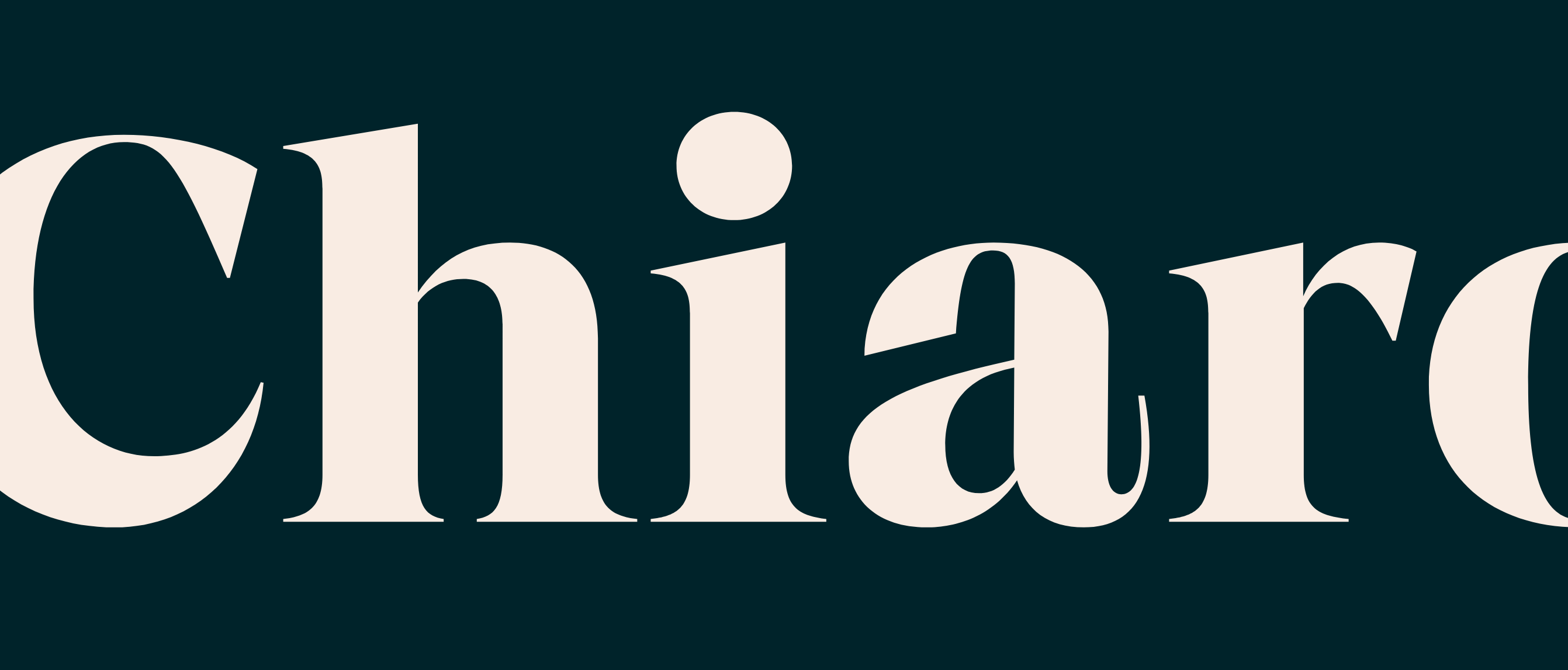
Jason also recently released a new typeface called Citywide.
Citywide is a sans serif family inspired by mid-1900s bus and train destination roll signs. The letterforms draw from a bus roll sign I found at a flea market years ago. I’ve probably lost myself staring at that sign everyday since, thinking about how the type system works while trying to puzzle out some of the unusual choices. Why are letters like P and R so high-waisted in their wide forms, but pretty normal when narrow? Were these boxy curves drawn by hand or mechanically produced? Why does the middle stroke of the G change so much across widths?
Citywide is an interpretation of these letterforms, drawing inspiration from both my sign and others like it.
~
I linked to Atkinson Hyperlegible recently, and here’s another typeface designed with accessibility in mind – Inclusive Sans from Olivia King.
via Pixel Envy
~
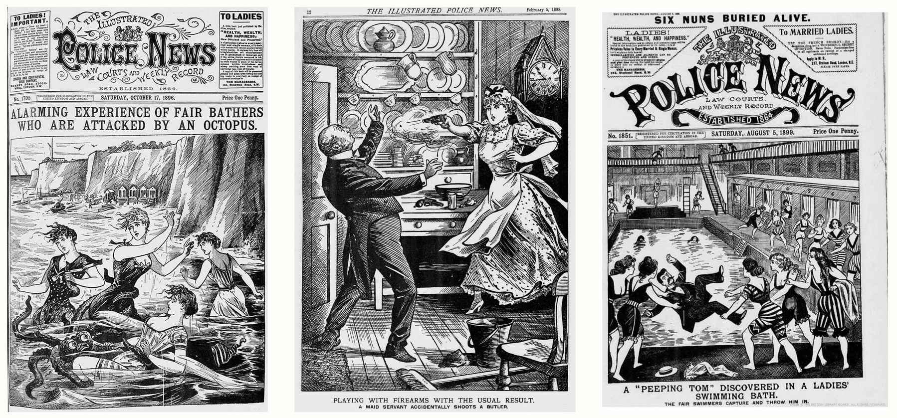
I have been slow to link to this but it is absolutely worth the time it takes to go through – let Marcin Wichary take you on an adventure in typography, chasing a mysterious typeface that appears to hide everywhere in New York in “The hardest working font in Manhattan”.
~
Its Nice That talks to the founder of Kyiv Type Foundry who have been (re)creating typefaces from various station signage of the Kyiv subway. Check it out for some niche type from the subway that, until recently, held the title of the deepest station.